

Internal · Brand & Label Reference · Not public
The KALTA design system —
built for the label.
The website is where KALTA's look already lives. This page pulls that identity into one place so the label can come from the same world — the same colors, type, the polyphenol idea, the badges, the sprig. Everything here is locked brand unless tagged pending.
How to read this
The current label is a little stale; the website is not. So the brief is simple — make the tin feel like it belongs to this brand. Each block below shows a brand element and how the site already expresses it. Color and type are exact and copy-ready. The polyphenol story, the three-badge grid and the olive sprig are the three ideas most worth carrying onto the tin. Anything marked pending isn't locked yet — flag before committing to print.
01 — The feeling
What KALTA is supposed to feel like
Quality made approachable through clarity, not compromise.
Modern food editorial — warm, communal, food-confident. Never clinical, never apothecary. If the label feels austere or untouchable, it's wrong; if it feels like it belongs on a real table at the end of a meal, it's right.
Design toward
Brightland · Diaspora Co · Burlap & Barrel · Fishwife · Pineapple Collaborative · Ottolenghi
color-block discipline · botanical illustration · tin mastery · warm editorial photographyDesign away from
Aesop · Le Labo · Graza · AG1 / Goop
apothecary austerity · perfumery register · bro-cooking informality · supplement/wellness02 — Color
The palette, exact
Two SKU palettes over one shared cream. Warm-vs-cool body contrast separates the SKUs; Label Cream is the bridge. Hexes are sRGB (digital). For print, these need Pantone TCX matches — pending, must close before the August 2026 FIRS submission.
Core / utility
KALTA · STANDARD palette forest + chartreuse
KALTA · RESERVE palette cobalt + orange
Usage rules — non-negotiable
- Body color dominates the tin. Never invert to a cream-dominant body.
- Wordmark & tagline are always Label Cream — never the accent color on the body.
- The accent (chartreuse / orange) is for the sprig, SKU mark and badge outlines only.
- No green on RESERVE. No blue on STANDARD. The SKU contrast is the whole system.
- Label Cream is the same hex on both SKUs — it's the family bridge.
⚠︎ Retired — never use
The accent was warmed Jun 22 2026: use #E2E64A, not the old #C8E84A.
Also dead: forest green #2D8B4E, deep teal #1F5E6B, charcoal #1A1A1A as canvas,
brass #AEA188, clay #B5653A.
03 — Type
The type system
04 — The idea
Polyphenols are the whole story
If one idea jumps from the website to the tin, it's this. KALTA isn't sold on provenance romance — it's sold on a measurable thing you can taste: the peppery sting at the back of your throat is oleocanthal, and it means the polyphenols are high. The label should make that legible.
total polyphenols · mg/kg
Everyday high-polyphenol. Comfortably above the EFSA line.
Released only at the top band — ~2.4× the EFSA threshold.
HIGH vs PEAK is load-bearing. On the tin, PEAK must read louder than HIGH — it's
what separates the two SKUs and stops RESERVE cannibalizing KALTA. Specific per-batch numbers never go on the
label; they live on kalta.co/batch/[code] behind the QR.
05 — Badges
Three badges. Never five.
A curated subset of the sourcing standard, chosen for a 3-second shelf read. Pills: Label Cream fill on the body field, thin accent hairline outline, Inter Medium uppercase, +120 tracking. The full five-criteria standard lives on the back panel, not the front.
KALTA · STANDARD front
KALTA · RESERVE front
pending — "HIGH POLYPHENOL" / "PEAK POLYPHENOL" wording is awaiting UAE regulatory clearance. VERIFIED PURE is no longer a front badge — it moved to the back-panel sourcing standard.
06 — Anatomy
The front face, top to bottom
Architecture is identical across both SKUs — only body color, accent, lid, SKU mark, badge content, tagline and tin size change. The public 500ml is just KALTA (no SKU mark on the tin); only the 250ml carries the — RESERVE — mark.
- 1Botanical sprigsingle olive sprig · accent color · upper third · ~25% of face
- 2WordmarkKALTA · Mencken · Label Cream · centered upper-middle
- 3SKU mark— RESERVE — italic Mencken in accent + hairlines (500ml omits this)
- 4Category descriptorHIGH POLYPHENOL EXTRA VIRGIN OLIVE OIL · Inter SemiBold · +60
- 5TaglineCormorant Italic · Label Cream · pending Remy's pick
- 6Three-badge gridcream pills · accent hairline outlines · Inter Medium
- 7Provenance100% PICUAL · JAÉN
- 8 SPAIN · Inter Regular · lower-left
- 9BATCH + QRBATCH 2026-NN-X + QR labelled BATCH REPORT · lower-right
Print specs
07 — The sprig
One olive sprig, accent-color line work
A single hand-drawn olive sprig — three to five leaves, two Picual-shaped olives — in the vintage Italian estate-label tradition (Frantoio Galantino, Maison Bremond, Castello Monte Vibiano). Accent-color line work on the body, upper third of the face. Restraint is in how it's drawn, not whether it appears.
Never on the label
08 — Current tins
What we're evolving from
The current renders, for reference. The colors and SKU split are right; the typography and sprig are where the label needs to catch up to the website.
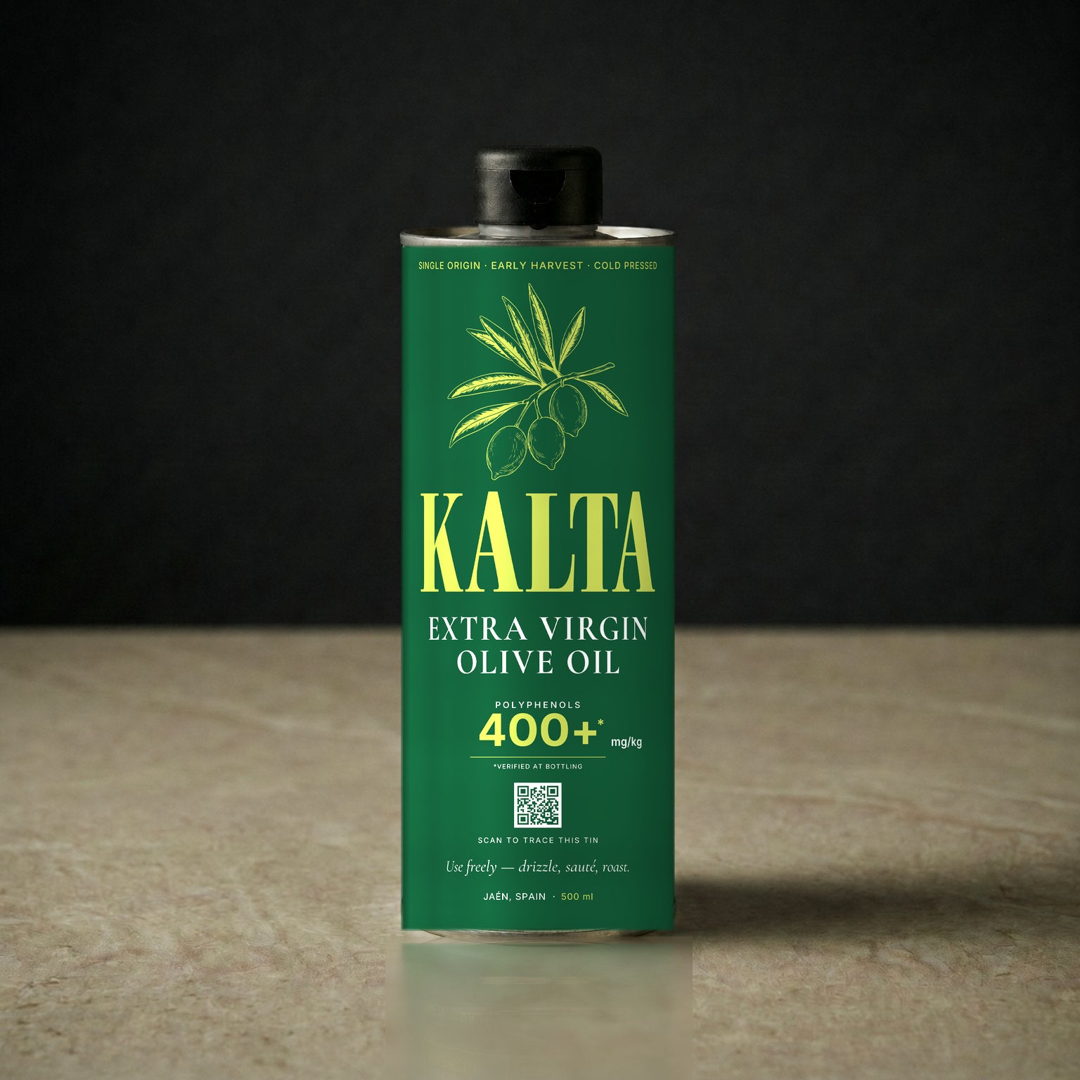
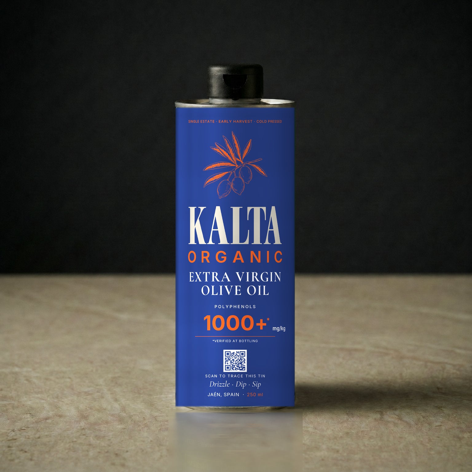
Naming on the tin: the 500ml is publicly just KALTA — "STANDARD" is an internal name only and never appears on tin or site. The 250ml is KALTA RESERVE. Prices are placeholders (AED X) until locked.
09 — Quick reference
Do / Don't
Do
- Use
#E2E64Achartreuse ·#FF5A1Forange - Names: KALTA (500ml) · KALTA RESERVE (250ml)
- Mencken wordmark · Cormorant Italic tagline · Inter everything else
- BATCH 2026-NN-X — no
#, never "LOT" - Make HIGH vs PEAK polyphenols legible
- Frame both SKUs for raw / finishing use — drizzle, dip, finish
Don't
- Old accent
#C8E84A· any retired token - Names TABLE · FINISH · DAILY (all retired)
- Playfair · Naville-DEMO as the real wordmark
- Words "artisanal" · "premium" · "authentic" · "daily ritual"
- Five badges · VERIFIED PURE on the front